

 Film and now electronic images have been influencing world events for almost a century now. The prison photographs coming out of Iraq this spring are images that not only are reshaping world opinion, but are also unique in both form and function. All of these pictures were made, as far as I know, by amateur photographers — people actually involved in the events themselves. Some say that as many as 1,000 such photos were made — all of them with digital cameras. In the past, most opinion changing images were made by professional photojournalists and videographers functioning as news reporters. These amateur photographers used digital cameras and computers — which allowed them to make, store, copy, and even transmit and ultimately publish their images via the Internet with instant ease, and at no cost. And so digital technology itself — this time in the hands of rank amateurs — has come to play a central role in shaping world opinion.
(Digital technology apparently also played a major role in still another picture-scandal coming out of Iraq this spring. Pictures published in the UK involving the British military were apparently electronic fabrications, undermining the validity of news reporting still again in this era of journalistic fraud.)
Another unique aspect of these crudely made digital snapshots made by American soldiers in Baghdad’s Abu Ghraib Prison is that those who made them were actually recording their own criminality in progress. Some images not only document their actions, but even go on to show us how these soldiers felt about what they were doing, as they went about doing it.
Still another important fact has emerged — many of these photos apparently were made as part of the actual punishment and pressure these soldiers are applying to their prisoners. They were making these pictures not just to record the event as documentation or personal souvenirs, but to further humiliate the Iraqi prisoners in their care, in order to “break” them.
Ultimately, these electronic images were not only published in newspapers and magazines everywhere, but also shown by television networks all over the world, and with varying contexts. In the most recent, and horrific, twist, the kidnapped American, Nicholas Berg, was murdered on videotape. According to his executioners, the killing was in reprisal for the American photographs coming out of Abu Ghraib prison.
Nobody can say where all of this will take us. The images themselves are only evidence — the substance rests in the brutality itself and its political effect on history. But when that history is written, electronic imaging will loom large as the visual story teller.
Phil Douglis, The Douglis Visual Workshops
Editor’s note: For another reading of these photos, see the May 23, 2004 New York Times article Regarding the Torture of Others(must be registered) by Susan Sontag — whose essays and books on the role of photography in society have given us much food for thought over the last 30 years.
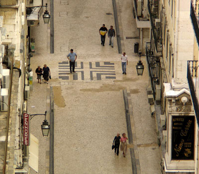 |
Lost in time, Lisbon, Portugal, 2004I shot this scene from the top of Lisbon’s famous, if somewhat battered, Elevador de Santa Justa. The iron elevator was built about 100 years ago by one of A.G. Eiffel’s apprentices. From my perch high over Lisbon, I used a telephoto converter lens to focus on a decorative motif set squarely into the middle of an intersection a few blocks away. I shot picture after picture of people walking through that intersection. Finally, I was able to get the proper spacing and interaction that would tell a story. In this cropped shot, I isolate eight people walking either to or from that decorative square in the middle of the intersection. I frame the scene between two signs and three vintage streetlights. Seven of these people seem to know exactly where they going. One, however, does not. He incongruously stands on the decorative pavement with his hands to his hips, wondering which way to turn. Needless to say, I could see him but he could not see me. I felt sorry for this guy and can empathize with him — it’s easy to get lost in time in the 200 year old streets of Lisbon – they can often start and stop without notice, disappear into plazas, and climb around hills, all of which makes it one of the most intriguing walking cities in the world. |

The familiar profile of Half Dome is over eight miles from this viewpoint, which is just beyond a tunnel cutting through the middle of a granite cliff.
From Phil Douglis’ Wisdom Lesson: Landscape Photography
 |
|||
| While visiting Chengdu’s Panda Research Center, we came upon a class of local students training for jobs in the hospitality and tourism industries. They were at the Center, no doubt, because of its importance to tourism in the area. The group was made up primarily of young women — the fellow in this picture has a tough act to follow. Copyright 2004 Phil Douglis
|

 |
Shanghai sits on the sea at the mouth of the Yangtze. Its land space is limited, and its eight million people make the population density of Shanghai one of the highest in the world. Its skyscrapers reach towards the heavens, as does this monument in the People’s Park. Copyright 2004 Phil DouglisDiscu |
 |
Yellow, White and Red
The colors of fall and winter greet each other near Bridgeport.
From Phil Douglis’ Wisdom Lesson: Landscape Photography |

Good lighting is the key to a good presentation. The audience should see as much of the presenter’s face as possible. The goal is to create an UNEQUAL distribution of light, with most of the light on the presenter, some light over the audience for note-taking, and no light on the screen (other than from the projected image, of course).
In smaller venues, such as a conference room, incandescent lighting works best. Those “recessed” lights usually have a dimmer control. Avoid fluorescent lights whenever possible because those are the least flattering and least controlled, and they cast an equal amount of light around the room. When the light is equal, the audience might be distracted by wall hangings, furniture pieces, and worst of all, a clock! But, by creating an unequal distribution of light, you keep the audience’s eyes focused on you and minimize other distractions around the room.
For larger venues, portable or moveable lights can be used, but must be arranged in advance. You only need two lights to “cross-light” the presenter effectively. Two lights are needed because a single light from one side creates shadows on your face on the opposite side. But cross lighting allows light to reach you from each direction and eliminates any shadows, regardless of whether you stand in the rest or power position.
A wall can be a barrier. It can hide things from us. But walls can also be very revealing, an expressive force in their own right. For centuries, people have been using walls to communicate their thoughts and ideas, their art and their feelings. A wall can define the character and purpose of an institution or a community. If walls speak to us, we can listen to them, each in our own way, with our imaginations.
Since walls can be such a powerful communication medium, they lend themselves to expressive imaging. We can juxtapose a wall with another subject, and create an expressive relationship between them. We can photograph the play of light and shadow on a wall to create mood and meaning. We can stress the texture, color, or condition of a wall to create symbolic meaning. We can look for information, decoration or desecration on walls, everything from instructions and warnings to fine art and personal graffiti — the silent shouts of those wanting desperately to be heard and recognized, and photograph all of it in an expressive manner.
In this gallery, I demonstrate how photographs can amplify the meaning of the messages walls send to us, and how they can make us listen to them with our imaginations. They are mostly selected from the portfolios of digital travel articles I’ve posted at: http://www.worldisround.com/home/pnd1/index.html
The initial examples were photographed in the fall of 2005 in Croatia, Montenegro, and Greece. More examples will eventually be added to this gallery from future trips. I welcome your comments, suggestions, ideas, and questions, and will be delighted to respond.
Primary Colors, San Miguel de Allende, Mexico, 2005
A small fountain in the courtyard of a San Miguel inn plays back the colors of late afternoon in Central Mexico. I draw heavily on texture created by the ripples to give the liquid a tactile quality. We can see these ripples in both the fountain’s bowl and in the pool that surrounds it. I’ve used a shutter speed of 1/125th of a second to extend the droplets of water flowing from the bowl. But the key to the success of this reflection is the rich, deep quality of the color. The air of San Miguel is clear, the altitude is high, and the color of the sky is a deep and pure blue late in the afternoon. The basin of the fountain is blue as well. The yellow comes from the newly painted walls of one of the inn’s casitas. The shape of the casita itself is strongly abstracted by the rippling waters that reflect it back to us. Both yellow and blue are primary colors to begin with, and when they are shot in warm late afternoon light at 6,000 feet to appear as textured reflections, their effect can be powerful.
Reflections are ubiquitous. They can appear as images seen in mirrors, on glass, water, or any shiny, reflective surface. Reflections often alter reality, transforming it into the stuff of fantasy. Another form of reflection is when light is thrown back or bounced off its source to illuminate something else in an indirect, subtle way. We can use both forms of reflection to express ideas, and even transform reality into entirely new forms of expression. Reflected light and images often go unseen, taken for granted. We must train our eyes to notice them, recognizing their potential meaning, and then use them as another way of seeing.
See an array of photographs based on reflected images and light in this gallery.
We have two opportunities to frame an image to help communicate an idea. First, and most important, is when we look into our viewfinder to make the picture itself. If we are not happy with the result, we can sometimes strengthen our photographs by cropping them, which gives us a second chance to use the boundaries of our pictures as a tool for expression. When I frame my travel images in my LCD viewfinder, I constantly watch the edges of my pictures, making sure that what is out should be out and what is in should be in. The frame functions as an editor – including or rejecting information according to our intentions. But framing images is more than just a matter of in or out. I also use it to suggest movement, imply the presence of content outside of the picture, and offer a sense of scale, intimacy, fragmentation, or depth. I can sometimes even abstract my subject with it.
Basic human values – the emotions, beliefs, traditions, and knowledge that we hold in common as human beings – are at the very core of expressive travel photography. You will find human values expressed in every arena of life itself – in the way we live, play, worship, and work. The workplace, in particular, is a wonderful source of images rich in human values. Wherever we travel, we will encounter people at work. Expressing their efforts to earn a living can reflect the essence of a culture, and bring a new dimension to your travel photography. This gallery will show you how to use images of the workplace to illuminate the culture you are interpreting with your camera.
You don’t have to walk into an office or factory to find good subject matter. You can always find people at work in stores and markets, on farms and in fields, on lakes and rivers, in public areas, churches, temples, construction sites – almost anywhere there is human activity.
Some photographers think that “street-photography” means just shooting pictures of people in public places. That is a very limited definition. For me, “street photography” means telling stories. It means showing how people spontaneously react and interact in public places. And in telling a story about a few people, I can also try to make a visual statement many people – because my street photography can potentially express ideas that carry symbolic, as well as specific, meaning.
In this gallery, I’ll share some examples of symbolic story-telling street photographs I’ve made during my travels, and explain to you how and why I shot them as I did. You will also find images based on street photography in my other galleries as well. For example, street photography is rooted in human values, and I devote Gallery Three to explaining why human values are at the core of expressive travel photography. Much effective street photography can also be abstract and incongruous in nature, and I explore those critical principles in my first and second galleries.
Street photography runs parallel to photojournalism. It relies on the same photographic instincts – an exquisite sense of timing based on anticipation, and a passionate understanding of human nature. It also requires you to be comfortable using your camera in the presence of strangers — a lot of photographers are shy about photographing human behavior, and it shows in their work because they are too far away, or rely on telephoto lenses that flatten perspective and often rob the picture of critical context for meaning. The late, great photojournalist Robert Capa, known mainly for his combat photography, was also an accomplished street photographer. (Combat photography is essentially street photography, only there is a war going on.) It was Capa who said “if your pictures aren’t good enough, you’re probably not close enough.” His passion for people was at the core of his work.
Capa’s friend and business partner, the late Henri Cartier Bresson, is also regarded as a street photographer, although he called himself a surrealist, and Capa suggested he market himself as a photojournalist or “he would never sell any of his pictures.” Cartier Bresson was the supreme master of the decisive moment – capturing a split second of human behavior with meaning, and then integrating that moment into a geometrically inspired composition that intensified the meaning of the story.
It is no accident that these great street photographers made a living shooting for journalistic publications. Photojournalism is visual story telling, too, only it is based primarily on newsworthy events and people.
I was inspired to produce a gallery based entirely on the ins and outs of street photography when fellow pbase photographer Jen Zhou abruptly made her startling transition from shooting beautiful landscapes, pretty flowers, and lovely architectural studies to eloquently photographing people spontaneously interacting with each other on the streets of her vibrant city of Shanghai. She called her gallery “Everyone Has a Story,” http://www.pbase.com/angeleyes_zyl/everybody_has_a_story), and it throbs with vitality and human values. Jen not only shows enormous potential as a visual storyteller, but she also uses the key principles of street photography that I demonstrate and explain in this gallery. I owe the idea for this gallery on street photography to Jen, and dedicate it to her. I hope that both she, and all of you, will benefit from it.
All of the initial examples posted in this gallery were made on the streets of various European cities in the summer of 2004. In the future, I will be adding examples of street photography to this gallery made elsewhere as well. I’ve selected these images from my portfolios of digital travel narratives I’ve posted at: http://www.worldisround.com/home/pnd1/index.html. I welcome your comments, questions, and criticisms with open arms, and will respond as soon as possible.
Expressive images use layers to deepen and broaden ideas. I speak of layering here as an organizing process, part of the structure of a photograph itself. (Don’t confuse this kind of layering with those post-processing layers that are often used to enhance or build an image in Photoshop.)
Layers can play a huge role in the composition of an image. We can read these layers from front to back, or from side to side. Layers can be used to create incongruous juxtapositions, or can create perspective by implying depth. We can guide a viewer’s eye through a composition by relating foreground, middleground and background layers of information. We can relate subject layers to context layers to help an image make its point. While some images are essentially flat, and require no layers, others may use two, three, or even four layers to express meaning. Layers can build substance into an image, enhancing not only its organization but its meaning. Layers can also create coherence by alternating soft and sharp planes of focus. They can even be used to abstract the subject, the final touch in building a delicious sandwich for the imagination – each level adding to the pleasure and substance of the whole.
In this gallery, I demonstrate how expressive images can make use of layering to express ideas and stimulate the imagination. These initial examples were photographed in Santa Fe, New Mexico, USA. More examples will gradually be added to this gallery from future trips. I welcome your comments, suggestions, ideas, and questions, and will be delighted to respond.
The Vision, Santa Fe, New Mexico, 2005
I was struck by the incongruity of this mural – a surrealistic halo-wrapped Virgin Mary rising from a barren desert amidst a pile of enormous flowers. And then I saw the barred window cut into the sky of the mural. Meanwhile, that is real earth at the base of the mural, supporting a bush, incongruously growing in front of the painting. One might wonder which came first, the bush or the painting? This foreground layer provides the only reality in the image, yet it miraculously merges into the mural – the middleground subject layer — as if it was a vision created by the Virgin Mary herself. The barred window, along with the curved sliver of sky overhead, reveals the entire mural as painted on the wall of a building, which in turn creates a background layer. It is fascinating – we can look at the building as either a structure or as a mural. In this image, these middleground and background layers can change roles, depending upon how you choose to look at them.
 Landscape photography is more than just taking pictures of a beautiful natural scene. It involves expressing your own feelings about what you see before you by using your choices in both light and space as your medium of expression.
In landscape photography we are essentially interpreting the power and beauty and meaning of nature in order to evoke thought and emotion from those who will view the image.
I am not primarily a landscape photographer. My roots are journalistic. People, and the work of people, hold the most fascination for me as an expressive photographer. However as humans, we live in the natural world. And expressive landscape photographs can help us to better understand, appreciate, and preserve that world we all must share. So there is very much a human story rooted in landscape photography after all.
In 2002, I participated in a three-week nature photography workshop in the Bering Sea with Galen Rowell, who along with Ansel Adams and Edward Weston, is generally considered to be among the most significant landscape photographers of the 20th Century. Tragically, it would be Galen’s last workshop. He died in a plane crash on the way home.
 Galen played a major role in opening my eyes to the expressive power of landscape photography. I will never forget him telling us that landscapes are not objects to be photographed. To photograph landscapes, he said, is to photograph light, and the effect of light, itself. Galen explained to us how twice each day, the cool, blue light of night interacts with the warm tones of day. What makes this so special, he told us, is that this mixing of tones is never the same. They mix in endless combinations, he said. I remember so vividly his wonderful metaphor. “It is as if someone in the sky was shaking a kaeleidoscope.” This effect, Galen told us, takes place not directly where the sun rises or sets, but where the sun’s rays beam warm direct light onto parts of land and sky that are also lit by the cool, reflected light of evening.
He also showed us how important the location of the landscape itself can be. Where the ocean meets the land, where the meadow meets the forest, where the timberline reaches for the heights. He always looked for what he called these “edges” – where such geographical edges as these combine with visual edges created by light itself.
Some may believe that landscapes are “easier” to photograph than people because they “don’t move.” How wrong they are. If, as Galen suggests, the subject of a landscape photograph is actually light itself, and if the features of land then become our context, our subject is always in motion – an ever-changing, elusive prey. Light changes from second to second, and minute to minute, as the sun and clouds and the earth itself move.
Adams and Weston were black and white landscape photographers. They interpreted the majesty and beauty of nature by weaving a range of tonalities into their prints that both abstracted and expressed meaning. Galen Rowell was a color landscape photographer. For him, and for myself as well, color adds a layer of meaning to the light itself, and must also be considered as a critical element of expression in landscape photography.
And finally there is composition – critical in drawing the eye through a landscape, providing scale, dimension, and the illusion of depth, as well as the other choices we must make in terms of space, including frame and vantage point.
As always, I invite your comments, questions and criticism, and will respond to all of them.
See Phil Douglis’ pBase Gallery 18: Light and Landscape – combining personal vision with nature’s gifts
State Fair, Albuquerque, New Mexico, 2003
Clutching a bag of popcorn and wearing a western style hat, a young fellow enjoys posing for Santa Fe Workshop photographers at New Mexico’s State Fair. Using a colorful background of stacked hats, other photographers set up their shots as straight-on environmental portraits. I crouched off to one side, and used a low camera positon to feature his enthusiastic response, and make the towers of hats stacked behind him seem to soar as high as his spirits.
As a teacher of photojournalism, I have always stressed the importance of conveying ideas through pictures that express basic human values — those emotions, beliefs, traditions, and knowledge that we understand and share as human beings. To me, expressive photography is built around a triangle of principles. Abstraction, a principle demonstrated in Gallery One, runs down one side of that triangle. Incongruity, demonstrated in Gallery Two, runs down the other side. And at its base is the principle of Human Values. Without the support of Human Values, demonstrated in Gallery Three, expression can not really take place. In this gallery, I’ll share with you some of my travel images that will show you how Human Values express ideas, selected from the portfolios of digital travel narratives I’ve posted at http://www.worldisround.com/home/pnd1/index.html. I welcome your comments, suggestions, ideas, and questions, and will be delighted to respond.
Since July, 1997, Hong Kong has been part of China under a special “One Country, Two Systems” arrangement. It is free to pursue its capitalist lifestyle and its own political, economic and social systems. It only submits to Chinese authority in foreign and defense affairs. In this photo, both the Hong Kong and Chinese Flags fly from Hong Kong’s City Hall, against a backdrop of I.M. Pei’s Bank of China skyscraper. I used my frame to contain eight thrusting diagonal lines and three strong vertical lines, creating a dynamic display of energy that complements the fluttering flags and hanging palm frond. The frame here is an editing device, unifying both the new building and the old, and creating a field for the elements that flow within it.
 Some believe that photographic “composition” is purely a matter of aesthetics. I don’t take this approach. Making a beautiful image, one that follows all the “rules of composition”, is not the way I shoot. Rather, I use composition to organize my pictures for meaning. How and why I relate things to each other within my frame, and how I emphasize the point I am trying to make, is more important to me than making a classically beautiful image.
I use a number of methods to build my images and make them work. Here I will be presenting images that reflect aspects of photographic composition. They are selected from the portfolios of digital travel narratives I’ve posted at http://worldisround.com/home/pnd1/index.html. I welcome your comments, suggestions, questions, and critiques
|
|
|
|


 Village street, Khajuraho, India, 2008
By Phil Douglis
I use negative space here to create tension between the two children. They are each looking in the same direction, but do not seem to notice each other. The silhouette of the young girl at left is echoed by the vertical post, as well as the window and door on the opposite wall. The young man sitting on the step wears a red shirt, which ties him to the large Coca-Cola ad on the wall. The entire image is pulled together by the shadowy dirt street itself –- it is linked to everything in the image.
Some believe that photographic “composition” is purely a matter of aesthetics. I don’t take this approach. Making a beautiful image, one that follows all the “rules of composition”, is not the way I shoot. Rather, I use composition to organize my pictures for meaning. How and why I relate things to each other within my frame, and how I emphasize the point I am trying to make, is more important to me than making a classically beautiful image. I always try to keep my viewers in mind. I hope that my composition will simplify the image for them, making it coherent. Our cameras see unselectively. We must make them see selectively — eliminating random chaos, rather than passing it on to the viewer. I use a number of methods to structure my images to make them express what I want to express. This is an example selected from my archive of digital travel articles posted at http://www.pnd1.smugmug.com/
I welcome your comments, suggestions, ideas, and questions, and will be delighted to respond.

By Phil Douglis
Photographers who make images to convey atmosphere, mood, beauty, and meaning, usually prefer to shoot during the first and the last few hours of the day. That’s when the light is warmer, the shadows softer and less harsh, the colors warm and the low angle of the sun can bring out texture and detail with striking dimensionality, clarity and relief. Some kinds of travel photography, such as landscapes and architectural studies, depend almost entirely on the beauty of the light for their meaning. For example, trying to make a landscape photograph with the sun high overhead invites a flat, evenly illuminated scene with harsh pockets of shadow.
As much as we would like to shoot during these “golden hours,” there are many times when our schedules simply make it impossible for us to do so. And so, we must often cope with light that is less than ideal for our purposes and hope for the best. How, then, can we make expressive photographs when the mid-day light is high in the sky, falling straight down on our subjects, creating harsh shadows and difficult contrasts?
This gallery demonstrates some approaches that worked for me, and may work for you, in the mid-day light. I start it off with fourteen images that I made while accompanying one of my tutorial students on two mid-day shoots: the first between one and three in the afternoon, and the second between ten and noon in the morning. On both days, the skies were clear, and the Phoenix, Arizona sunlight mercilessly poured down on us from straight overhead.
As you will l see, I often try to make use of the harsh light itself to tell part of my story. I underexpose many of these images to avoid burning out highlights, and in the process, I create shadows that can abstract the subject and imply meaning. I often look for shadows that create patterns and rhythms to enrich expression. (To systematically under-expose to avoid burning out highlights, simply adjust your “exposure compensation” control to “minus two thirds of one stop” and using your spot-metering mode, take your exposure reading on the brightest spot in the frame. Your image will become darker than usual, creating abstraction. You can restore any essential details later in post processing.)
I also try to make use of backlighting, which creates silhouettes, as well as shooting subjects within shaded areas such as windows, awnings and umbrellas. I often shoot towards the sun, using backlighting to create luminosity, causing some subjects to glow as the light passes right through them. I will photograph in completely shaded areas, looking for soft reflected light bouncing off nearby surfaces as my illumination source. I may even forsake outdoor photography itself and choose to work inside of buildings during the hours of “bad light,” photographing my subjects in the indirect natural light passing through doors and windows.
 Barren branches, Harshaw, Arizona, 2009

Historical harmony, Ipswich, Massachusetts, 2009, By Phil Douglis
A figure out of Ipswich history is painted on the side of this building, once used as a mill by General Electric. His head is arched, as if he is listening to voices from the past. Next to him, old window glass reflects a distorted view of another old building in the town. I honed down the image to just these two elements. Together they achieve a sense of historical harmony.
Reflections are ubiquitous. They can appear as images seen in mirrors, on glass, water, or any shiny, reflective surface. Reflections often alter reality, transforming it into the stuff of fantasy. Another form of reflection is when light is thrown back or bounced off its source to illuminate something else in an indirect, subtle way. We can use both forms of reflection to express ideas, and even transform reality into entirely new forms of expression. Reflected light and images often go unseen, taken for granted. We must train our eyes to notice them, recognizing their potential meaning, and then use them as another way of seeing.